Introduction to Matplotlib
Matplotlib is one of the most widely used libraries in Python for data visualization. It helps turn raw data into readable graphs and charts, which makes patterns and trends easier to understand.
- It is especially useful in Exploratory Data Analysis (EDA).
- The main module used is
pyplotfrommatplotlib.
Why Matplotlib?
- Converts numerical data into visuals like line charts, bar plots, pie charts, etc.
- Helps in comparing values, identifying trends, and spotting outliers.
Basic Structure of a Matplotlib Plot
A typical plot has several components:
- Figure: The entire window or page.
- Axes: The plot itself, where x and y data are drawn.
- Title, X/Y Labels, Legends: Help make the chart understandable.
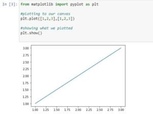
Example
Types of Charts in Matplotlib
1. Bar Chart – Useful for comparing categories

A  bar graph presents data with heights and lengths proportional to the values they present.
Example:
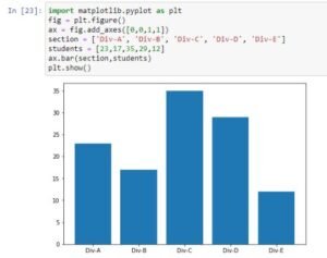
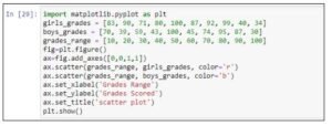
The axes label is a region of the image with data space.
An axes object is added to figure by the add_axes() method. The syntax for the axes object is: ax = fig.add_axes([left,right,width,height]).
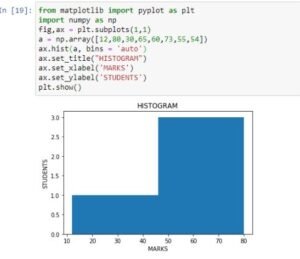
2. Histogram – Shows distribution of data

A histogram is used to understand the distribution of a continuous numerical variable.
Example:
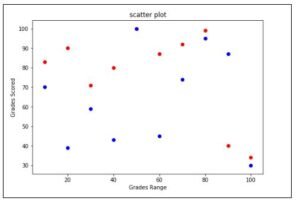
3. Scatter Plot – Shows relationship between two numeric variables
Scatter plots are used to represent values for two different numeric variables.
Example:
Output:
Customizing Plots
Matplotlib offers many ways to personalize a plot:
- Change colors and line styles
- Add grid lines
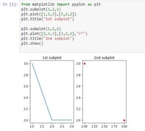
- Use subplots to create multiple charts in one figure
