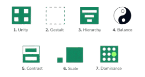
Visual Design Principles
When presenting data, how you design your visuals plays a critical role in how clearly and effectively your message is communicated. Good design makes your data easy to understand, highlights what matters most, and avoids confusion. This topic focuses on the key visual design principles you should follow when creating dashboards, charts, and data stories.
1. Simplicity
Your visual should focus on what matters most, without unnecessary clutter.
- Remove gridlines, 3D effects, and decorative elements unless essential
- Use clean, readable fonts and consistent spacing
- Avoid overloading with too many colors or chart types
Example:
Instead of using a 3D pie chart with 10 slices, use a simple bar chart to highlight top 3 categories.
2. Consistency
Keep your visual language consistent across all elements so that users don’t have to relearn anything.
- Use the same colors for the same categories across different visuals
- Maintain consistent axis scales, labels, and date formats
- Align titles, legends, and charts for easy comparison
Why it matters:
Consistency builds trust and reduces mental effort for your audience.
3. Emphasis
Use design elements to draw attention to what’s most important.
- Use color contrast or bolding to highlight key insights
- Sort bars or data points so the important ones appear first
- Add annotations to call out significant values or trends
Tip:
Don’t use color just for decoration. Use it intentionally to highlight or categorize.
4. Alignment & Layout
Good layout ensures that information flows logically and is easy to follow.
- Use a grid layout to organize your visuals
- Align text and charts vertically or horizontally for readability
- Place key insights at the top-left or center, where the eye naturally goes first
Example:
In a dashboard, put KPIs at the top and supporting charts below.
5. Use of White Space
White space (empty space) is not wasted space. It helps create visual breathing room and draws focus to content.
- Avoid crowding charts too close together
- Use margins and padding to separate sections clearly
- Let important visuals stand alone with space around them
Result:
The design feels clean, modern, and easier to digest.
6. Accessibility
Design should be usable by all users, including those with visual or cognitive challenges.
- Use colorblind-friendly palettes
- Avoid relying on color alone to differentiate information
- Use readable font sizes and ensure sufficient contrast between text and background
Tools:
Sites like ColorBrewer and Tableau’s built-in palettes offer accessible color choices.
Summary Table
| Principle | Purpose | Example Tip |
|---|---|---|
| Simplicity | Focus on the message | Remove unnecessary elements |
| Consistency | Reduce confusion | Same colors/labels across charts |
| Emphasis | Highlight key insights | Bold titles, sort data, use color cues |
| Alignment | Guide the user’s attention | Use grids and structured layouts |
| White Space | Improve readability | Space out charts and sections |
| Accessibility | Make visuals usable by all viewers | Avoid red/green-only color coding |
