Chart Types in Tableau – Dashboards & Stories
Understanding the different chart types in Tableau is essential to turning raw data into clear, impactful visual stories. Each chart serves a unique purpose, helping you explore patterns, spot anomalies, and communicate insights effectively. Here’s a breakdown of the key chart types you’ll use often in Tableau:
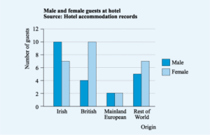
1. Bar Charts – For Comparing Categories
Bar charts are perfect when you need to compare data across categories like regions, product types, or customer segments.
- Vertical bar charts show how values differ across categories.
- Horizontal bar charts are better for long category names or ranking items.
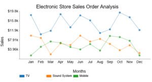
2. Line Charts – For Trends Over Time
Line charts help you visualize how a metric changes over time, making them great for time series analysis.
- Use it for daily sales, monthly revenue, or user growth.
- Multiple lines can show comparisons between different items over time.
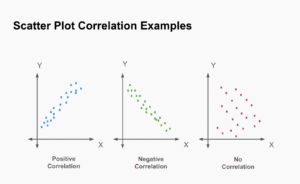
3. Scatter Plots – For Relationships Between Values
Scatter plots show relationships between two numerical variables.
- Each dot represents a single data point (like a customer).
- You can analyze correlations, clusters, and outliers.
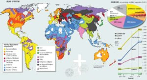
4. Maps – For Geographic Analysis
Maps let you place your data on geographical locations, helping you explore location-based trends.
- Symbol maps show circles sized or colored by value.
- Filled maps shade regions based on a metric (like total revenue).
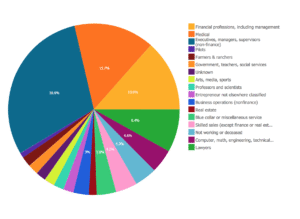
5. Pie Charts – For Proportions
Pie charts display parts of a whole. Each slice shows a category’s share.
- Best used for a limited number of categories (4–5).
- Quickly show which segment dominates.
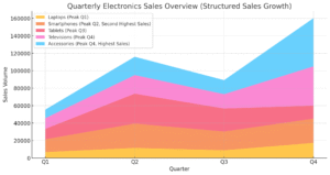
6. Area Charts – For Showing Volume Over Time
These are like line charts, but the space under the line is filled in.
- Good for showing cumulative trends over time.
- Useful when both trend and volume matter.
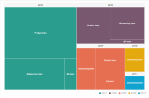
7. Tree Maps – For Hierarchical Data
Tree maps show nested data using rectangles sized by value.
- Great when dealing with hierarchical data or subcategories.
- Let you compare relative performance at a glance.
8. Heat Maps – For Patterns Using Color
Heat maps use color intensity to highlight concentration or performance.
- Great for analyzing across two dimensions (e.g., region and product).
- Helps you quickly spot highs, lows, and outliers.
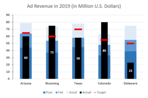
9. Bullet Graphs – For Target vs. Actual
Bullet graphs compare performance against a goal, target, or benchmark.
- Compact, data-dense, and more informative than a gauge.
- Often used in executive dashboards to track KPIs.
Final Thoughts
Each chart type in Tableau tells a different story. Choose your chart not just based on how it looks, but based on what you want to say with your data. Whether it’s comparing values, showing changes, uncovering relationships, or analyzing locations, using the right chart helps your audience quickly understand the message behind the numbers.
