Charts and Data Visualization Techniques
Visualizing data effectively is one of the most critical aspects of dashboard creation. In this module, students will explore how to transform raw data into meaningful visual stories using a variety of Excel charts and visualization techniques. The aim is to help decision-makers grasp trends, comparisons, and patterns at a glance.
1. Understanding the Role of Charts in Dashboards
Charts provide a visual summary of large data sets, making it easier to spot trends, correlations, and outliers. When designing dashboards, selecting the right chart type for the objective is key—be it showing growth, comparing categories, or tracking progress.
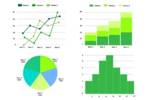
2. Commonly Used Excel Charts for Dashboards
Students will learn when and how to use the following chart types effectively:
- Column and Bar Charts – For comparing categories like monthly sales, regions, or product lines
- Line Charts – Ideal for showing trends over time such as revenue growth or customer churn
- Pie and Doughnut Charts – Best for visualizing proportion and market share
- Combo Charts – To compare two different data series (e.g., sales vs. profit margins)
- Scatter Plots – For correlation analysis between two variables like marketing spend vs. ROI
3. Enhancing Charts for Clarity and Impact
Students will explore design techniques that enhance readability and communication, including:
- Adding data labels, legends, and trendlines
- Using color coding and gradients to emphasize key points
- Formatting axes and scales to avoid misleading interpretations
- Applying chart filters to allow user interaction in dashboards
4. Advanced Visualization Elements
Beyond traditional charts, students will also be introduced to:
- Sparklines – Miniature charts embedded in cells to show trend within rows
- Gauge Charts – Used for KPIs like performance or satisfaction scores
- Heat Maps – Created through Conditional Formatting to visualize data density or intensity
- Dynamic Charts – Built using named ranges and drop-downs to respond to user inputs
