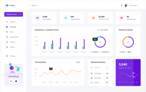
Dashboard Design Principles
Creating an Excel dashboard is not just about inserting charts and visuals—it’s about organizing data in a meaningful, accessible, and action-oriented way. This topic focuses on the core principles students must follow to build dashboards that are both functional and visually effective.
1. Define the Purpose and Audience
The first principle is clarity of purpose. Before designing, students must understand:
- Who will use the dashboard (executives, analysts, clients)?
- What decisions will it support?
- What KPIs or metrics matter most to that audience?
This clarity will help determine the data layout, chart types, and interactivity features.
2. Simplicity and Minimalism
A cluttered dashboard causes confusion. Teach students to:
- Avoid excessive colors, fonts, and decorations
- Use white space and grid alignment for neat organization
- Limit the number of visuals per screen to avoid overwhelming users
- Focus on key metrics and avoid adding every available chart
A clean, minimalist design directs focus to what matters most.
3. Logical Layout and Flow
Dashboards should follow a logical reading pattern—typically left to right and top to bottom. Students should:
- Place summaries and high-level KPIs at the top
- Group related data visuals together
- Use consistent spacing and alignment
- Include headings and brief labels to explain chart purpose
A good layout enables quick scanning and comprehension.
4. Consistency in Visual Elements
Consistency helps users interpret data faster. Students must apply:
- Uniform chart styles and color palettes across the dashboard
- Standardized fonts, label sizes, and formats
- A fixed number format (e.g., all currency in INR or USD)
- Same scale and axis orientation for comparison charts
This makes the dashboard look professional and cohesive.
5. Interactivity and User Experience
For advanced dashboards, teach students to add:
- Drop-down menus or slicers to filter data
- Buttons or check boxes for navigation or toggling views
- Dynamic charts that respond to user selections
These features improve usability and make dashboards more engaging.
