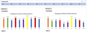
Interactive Charts with Slicers
Adding interactivity to dashboards transforms static reports into dynamic tools for data exploration. One of the simplest and most effective ways to achieve this in Excel is by using Slicers—a visual filtering component that lets users interact with charts in real time.

1. What Are Slicers?
Slicers are graphical filter tools that allow users to control what data is shown in tables, pivot tables, and charts. Instead of manually applying filters, users can click on slicer buttons to instantly update the data displayed.
- They represent filter options as clickable buttons.
- Multiple slicers can control different dimensions (e.g., Region, Product, Date).
- They provide a user-friendly alternative to drop-down filters.
2. Connecting Slicers to Pivot Charts
To create interactive charts:
- First, build a Pivot Table and a corresponding Pivot Chart.
- Then, insert a Slicer (via the Insert > Slicer menu).
- Connect the slicer to the Pivot Table fields such as Category, Segment, or Date.
- As the user clicks different slicer options, the Pivot Chart updates automatically.
This real-time response makes dashboards far more intuitive and insightful.
3. Designing Effective Interactive Charts
To ensure slicers enhance user experience:
- Position slicers beside or above charts for visibility.
- Resize slicers to match dashboard layout.
- Use consistent colors and styles to match dashboard aesthetics.
- Limit slicer items to avoid clutter (e.g., group data if needed).
Charts should update seamlessly and provide instant visual feedback based on the selected slicer values.
4. Multi-Slicer Integration
Slicers can be layered for complex filtering:
- Example: A user selects “North Region” in one slicer and “Electronics” in another to view data for only that segment.
- For deeper analysis, slicers can be synced to control multiple Pivot Tables and charts simultaneously.
This layered interaction empowers users to uncover insights from multiple angles, making dashboards more impactful.