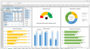
Pivot Charts & Dashboards
A powerful Excel dashboard often relies on Pivot Charts for visual storytelling. Pivot Charts are dynamic visual representations based on Pivot Tables, enabling users to spot trends, patterns, and outliers effortlessly. Integrating these charts into a structured dashboard provides a compact, real-time overview of data performance.
1. What Are Pivot Charts?
Pivot Charts are visual elements that are directly linked to Pivot Tables. As data in the Pivot Table is filtered, grouped, or rearranged, the Pivot Chart automatically updates to reflect those changes.
- Useful for summarizing large datasets visually.
- Provide immediate insights with minimal manual charting.
- Can be used with slicers and timelines for interactivity.
Common Pivot Chart types include Column, Line, Pie, and Bar charts.
2. How Pivot Charts Enhance Dashboards
In dashboards, Pivot Charts serve as the visual focal points:
- Allow for visual comparisons of performance metrics across time, categories, or regions.
- Can quickly communicate trends like sales growth, cost reduction, or customer acquisition.
- Simplify complex datasets through clean visuals, reducing the cognitive load on decision-makers.
They help turn data into digestible visual narratives.
3. Steps to Create a Pivot Chart Dashboard
To build a dashboard using Pivot Charts:
- Prepare the raw data and format it as a table.
- Insert a Pivot Table and summarize data by the necessary dimensions (e.g., Sales by Region).
- Create a Pivot Chart from the Pivot Table.
- Add Slicers or Timelines for interactivity.
- Arrange multiple Pivot Charts in a clean layout on a new sheet (Dashboard sheet).
- Apply consistent formatting, titles, and chart styles.
4. Best Practices for Pivot Chart Dashboards
- Use neutral and consistent color schemes for readability.
- Avoid clutter: only show necessary KPIs or visuals.
- Keep axis labels and legends clear.
- Limit the number of charts per screen—ensure the dashboard tells a story.
- Name sheets and chart elements clearly for user orientation.
