Introduction to Plotly
Plotly is a modern Python graphing library that lets you build interactive, browser-based visualizations. Unlike Matplotlib or Seaborn (which generate static images), Plotly creates charts that users can zoom, hover, and filter interactively.
It’s especially useful for dashboards, web-based reports, and exploratory data analysis.
Why Use Plotly?
- Interactive: Hover tooltips, zoom, pan, and filter are built-in.
- Web-ready: Easily integrates with web apps and notebooks.
- Simple syntax: High-level APIs for beautiful charts with few lines.
Common Plotly Express Charts
1. Scatter Plot with Hover and Zoom
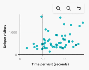
This lets users hover over each point to see details and zoom into areas of interest.
2. Line Chart
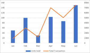
Ideal for time series visualizations. Users can hover to get values per year.
3. Bar Chart
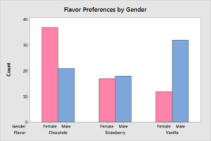
Interactive bars help compare multiple categories easily.
4. Pie Chart
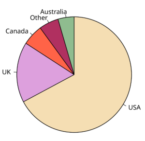
Pie charts in Plotly are clickable, hoverable, and animate on interaction.
5. Map Plot (Geographical Data)
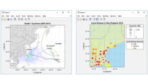
Interactive world maps are possible with very few lines of code.
Customization and Interactivity
Plotly graphs can be easily customized:
- Tooltips can be edited
- Legends are clickable
- Filters and sliders can be added to dashboards
