Introduction to Seaborn
Seaborn is a powerful data visualization library built on top of Matplotlib. It simplifies the creation of complex statistical graphs with just a few lines of code and comes with attractive default styles.
Why Use Seaborn?
- Great for exploratory data analysis (EDA).
- Designed to work well with pandas DataFrames.
- Provides high-level functions for statistical plots, such as distribution plots, box plots, and regression plots.
Seaborn Setup and Dataset Loading
Seaborn comes with built-in datasets (like tips, iris, etc.) for practice.
This tips dataset contains restaurant bill data including features like total_bill, tip, sex, day, and time.
Common Statistical Plots in Seaborn
1. Histogram + KDE Plot: Distribution of a numeric variable
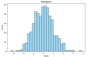
KDE (Kernel Density Estimation) shows the smooth curve of distribution.
2. Box Plot: Visualizes spread and outliers
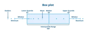
Useful for understanding median, quartiles, and outliers.
3. Violin Plot: Combines boxplot and KDE
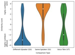
Shows the full distribution shape, not just summary statistics.
4. Bar Plot: Mean of a variable for each category
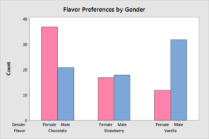
Automatically calculates the mean and confidence interval.
5. Scatter Plot with Regression Line (regplot)
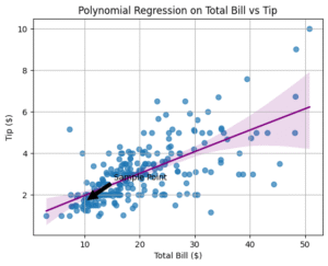
Great for showing relationships and trends between two numeric variables.
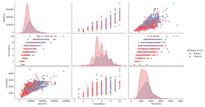
6. Pair Plot: Multiple scatter plots to compare variable


Very useful for multivariate analysis and pattern detection.